
Created by Design for Good
WHAT WE NEED
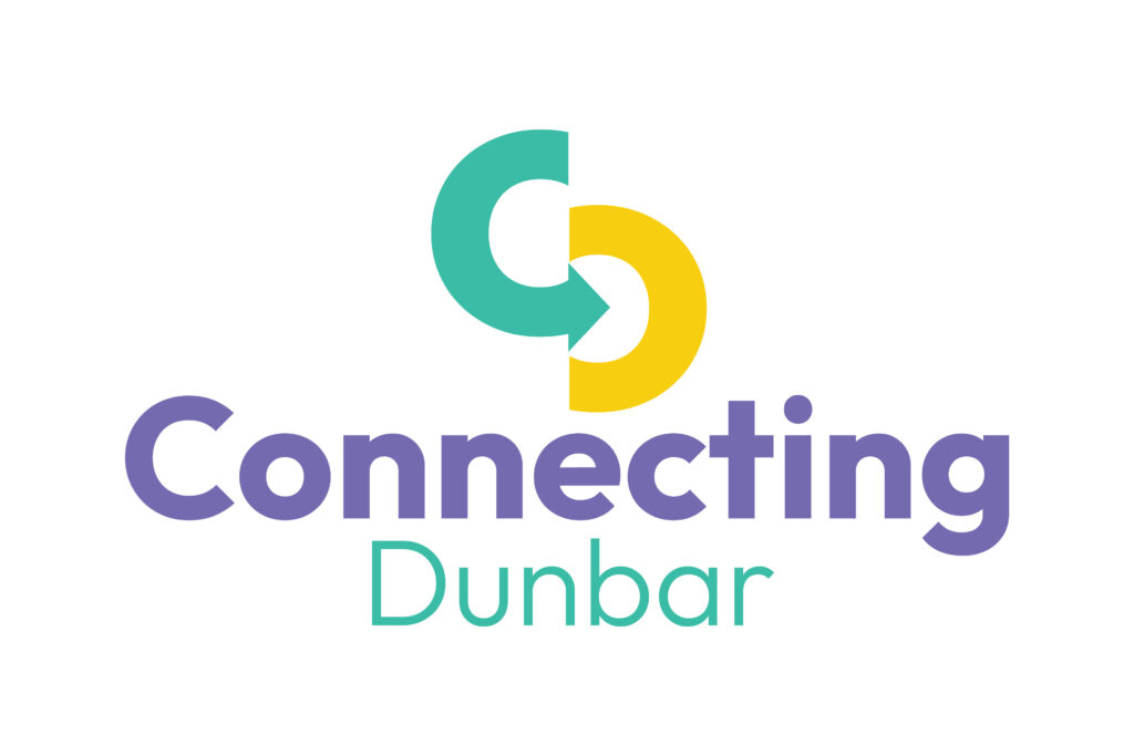
We would like a fresh and inviting brand / logo with broad appeal, along with a simple but vibrant colour scheme, choice of typography and associated iconography that we can use flexibly on a website, newsletters, marketing assets, socials and print.
PROJECT OVERVIEW
The project aims to engage the whole community to help co-design and deliver safer, attractive and rational a Dunbar-wide walking, wheeling and cycling network that works for all users, young or old regardless of ability or background.
The project aims to encourage behavioural change and make it easier to switch to active travel modes, which in turn will help reduce the number of short journeys by car to typical destinations e.g. shopping, the railway station etc., moreover save people time and improve everyone’s health and well-being.
AIM
To develop an appealing brand and strapline that communicates effectively to a wide and heterogenous community the project’s inclusive aim i.e. of improving walking and wheeling facilities and making it easier for all to leave the car behind.
SPECIFICATIONS
The brand needs to appeal widely across age groups and communicate clearly the project aims and objectives, but simply without clutter or complexity. We would like
- A fresh and original logo that can be displayed at a range of sizes from very small (small icons for mobiles and websites etc) to very large (e.g. banners). We want to be able to deploy the logo in 2 tone color without gradients and be able to render it in monotone colours, white or black.
- We want to be able to use the logo with or without the Connecting Dunbar project name
- A simple colour scheme that complements the logo that we can employ easily on the website, infographics, short videos, and print assets
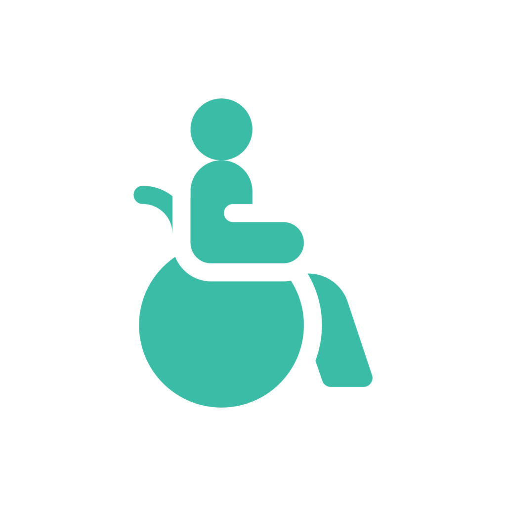
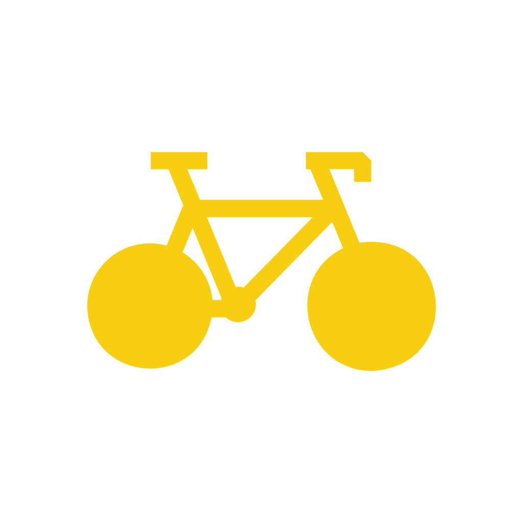
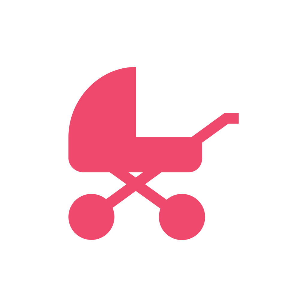
- An initial small collection of scalable icon assets that we can use in socials, online reports which help to illustrate active travel – the initial set would cover e.g. young cyclists, wheelchair users, wheelers, pram users, walkers – using gender neutral imagery (these could be open sourced); we want to be able to build on the initial set.
- Recommendations for a website typography – preferably employing open source web based fonts and for use in print
- Develop a very short 1 page Style Guide that will govern our communications, encouraging use of plain English and using the logo and colours correctly.
TONE
We want the graphical assets and colour scheme to communicate visually in a friendly and informal way. We want to be inclusive.
We don’t want to come across as stuffy, preachy or orthodox.
We would like to avoid hackneyed assets in our comms e.g. overused or cheesy clip art or unoriginal stock photos or the common ‘hand drawn’ font which is often used.
ACCESSIBILITY
We want brand assets that are easy on the eye for all users, including those who have visual impairments.
MILESTONES
End of March
Draft branding with external designer – so that we can start to develop the website presence
End of April
Finals in jpg, png, tif, .ai as appropriate, incl all design assets.


You must be logged in to post a comment.