
-
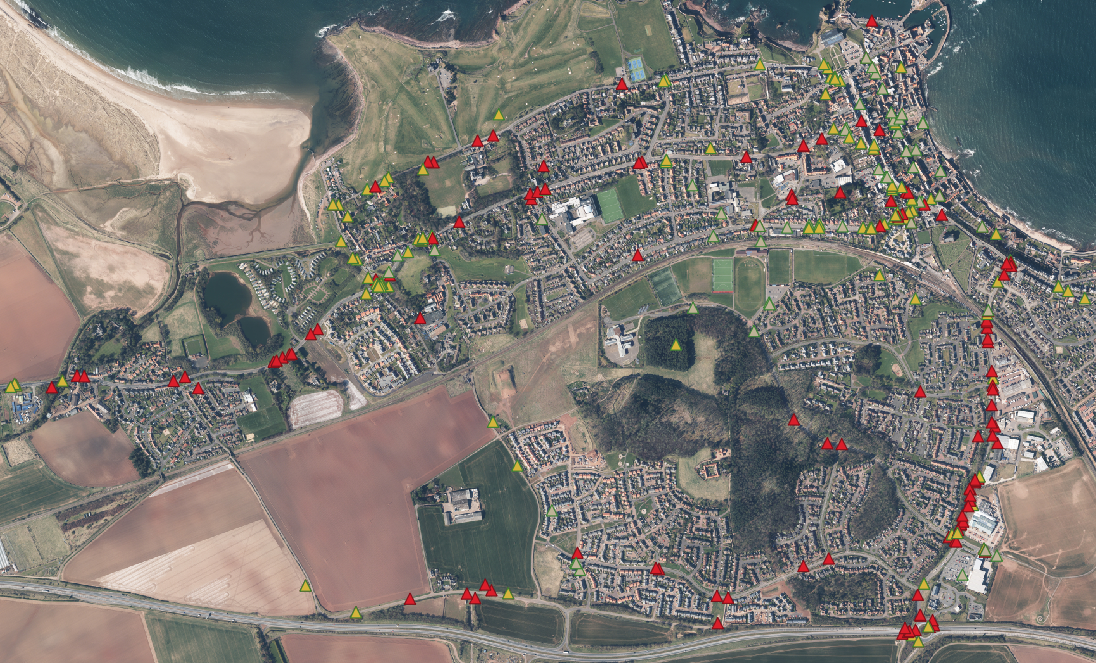
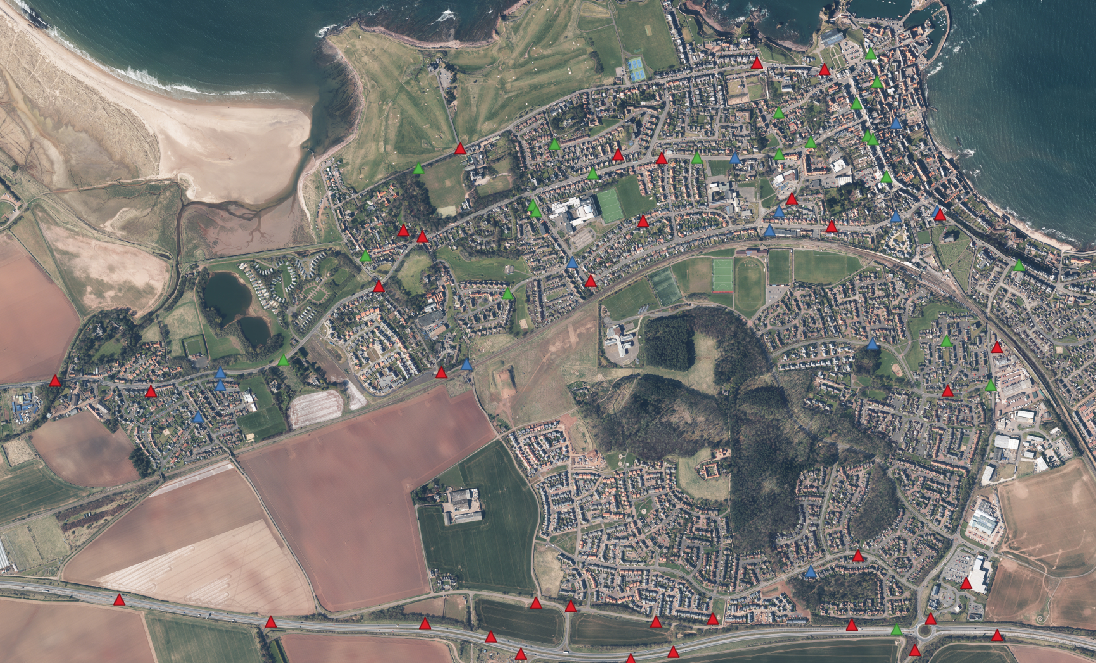
1 Favourite spots

Each triangle in the featured image above represents a favourite location submitted via the questionnaire. Respondents clearly enjoy quiet traffic-free places by…
-
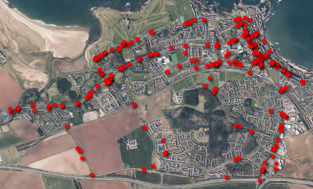
2 Problem places
In the presentation above we have picked out areas of fast traffic (red), parked cars (buff) and poor visibility (yellow). The ranking…
-
3 Near Misses
We collected reports of incidents and classified them by recency and type. We also asked whether you reported the incident. Most near…
-
4 Favourite Routes
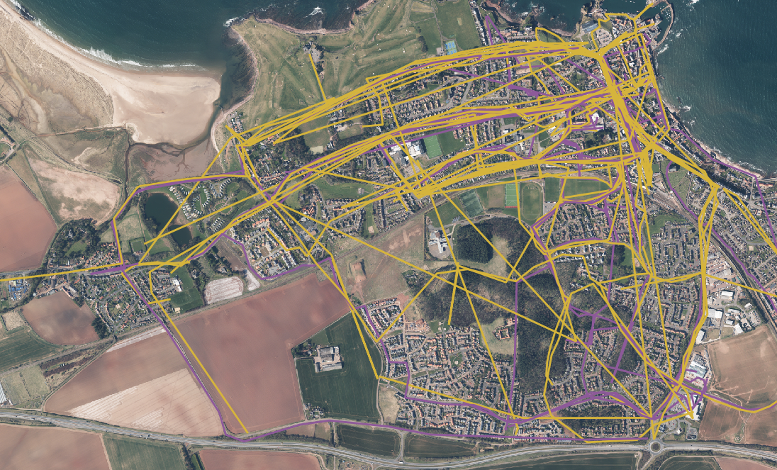
Routes to the shops and to work are highlighted in the presentation above. Leisure and exercise journeys feature alongside trips to the…
-
5 Desired routes
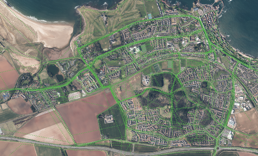
In the presentation above the green hashed lines represent desired routes (curently not used or non existent). Utility journeys (for work and…
-
6 Collision Data
These data are courtesy of Bike Data Cycle Streets, which we have classified by severity (slight,serious,or fatal). Below we’ve tabulated the results…